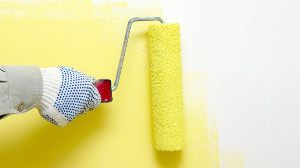


Paints are available in two main types: oil and plastic. Oil paint is the most common and suitable color for painting on the wall of the building; Because it is washable and has a long life. Oil paint is ideal for painting buildings and painting walls, while plastic paint is suitable for painting wood. You can also use oil paint to paint wooden frames, doors and cornices and paint the ceiling with plastic paint. Also keep in mind that oil paint dries slower than plastic paint.
What is the best color of the glossy or matte color?
Oil paints are produced in three categories: glossy, semi-glossy and matte. The glossier the color, the easier it is to clean. It is better to paint the kitchen and children's room with shiny colors; Glossy paint is easy to clean with a wet sponge. The glossy color shows the unevenness of the surface and is not very suitable for the living room and reception. You can paint the walls with a matte color and the baseboards with a glossy color so that they have a better appearance. They are not shiny.
If the plastering of the house wall has too many waves and defects, it is better to choose a matte color. Usually, one coat of paint is enough to paint the building with matte paint. The main drawback of matte paint is that it does not clean well and shows stains; It is better than matte paint on the wall that gets less dirty; Use it like the walls of the rooms.
What color to choose from for building painting?
If you intend to sell the house, it is better to choose white or cream color for painting the building so that the house looks brighter and cleaner and the next buyer can easily change the color of the walls according to his taste. However, it is better to take help from the brochures and consult with the building painter and paint seller to choose the most suitable color. By choosing different color ranges, you can give each room of the house a different personality and appearance.
A good way to choose colors is to use the color wheel. We are all familiar with primary colors; Consider a clock face and imagine the colors red, yellow and blue at the 12, 4 and 8 o'clock positions. The combination of each of these colors creates a new color. Those colors that are close to each other in the color wheel; Like blue and purple, they belong to the same family and help make a color stand out more.
Those colors such as green and red that are opposite each other complement each other and create beautiful combinations together. Using different shades of a color like green creates a soft and relaxing atmosphere. Painting small rooms with cold colors such as blue, green and purple makes them look bigger and more open, while the combination of yellow, red and orange colors makes the room full of energy and cheerfulness. By choosing other ranges of these colors; For example, using pink, peach and lemon next to yellow and red can balance this heat. Each warm color has a cold complementary color and each cold color has a warm color as a complement.